
Whisky drinking is a culture. A culture that is different across all countries and cultures. The origin-country of whisky brands resonate with their typography and design.
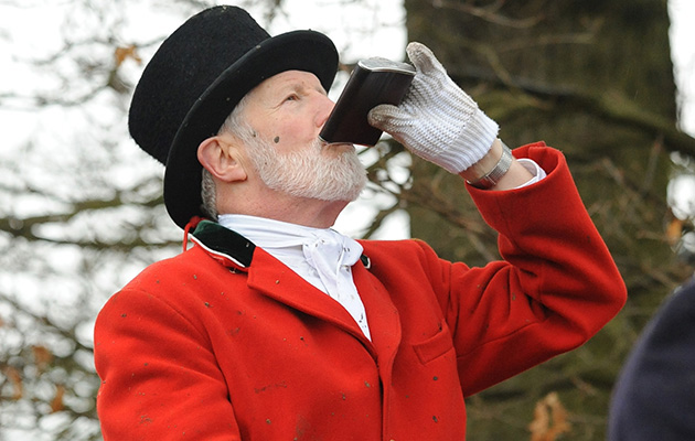
In the UK the culture is heavily agricultural. The activities that come from living in the countryside or working in agriculture go hand in hand with drinking whisky. Believe me, having grown up with this lifestyle I went to countless hunts and shoots, where everyman had a hip flask full of whisky on him. This is where I believe the stigma behind whisky being a man’s drink comes from.
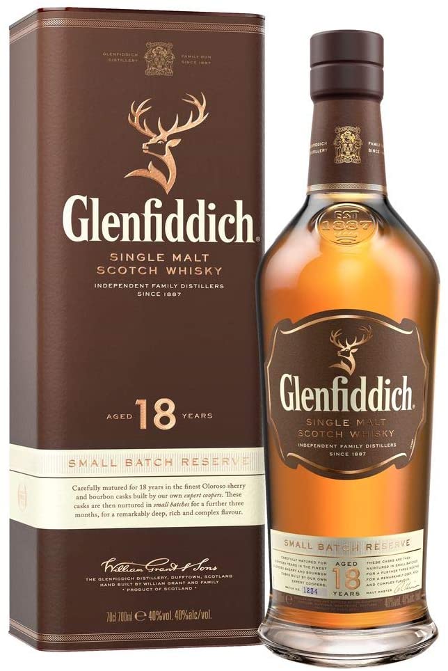
Glenfiddich is a brand of whisky that is designed for this UK old English culture. Having a stags head as the logo indicates its intended market base. The typography of Glenfiddich has evolved over time, starting in 1887 with cursive handwriting and gradually modernising and creating its distinct identity. Currently, the font is quite bold and serifed, not particularly individualistic, but then it doesn’t need to be due to the brand’s reputation as a high-end whisky. The brand as a whole comes across as classic and simplistic yet at the same time elegant and refined. It is achieving this through its use of packaging, logo and typography; the bottles themselves are shaped and moulded with the whisky establishment date, as well as the text on the labels being engraved with a gold finish. These are all expensive elements to manufacture, therefore proving it is a successful high-end whisky.
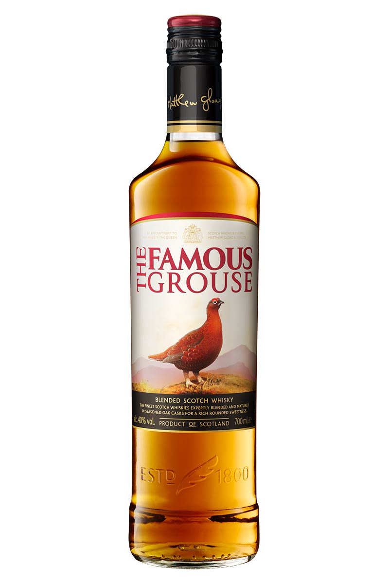
Glenfiddich though is not the only quality brand of whisky in the UK that is aimed at the agricultural community. The Famous Grouse is another favourite amongst the English culture: the clue is in the name. It is not as expensive as Glenfiddich, however, it is not exactly cheap. The difference in the price of these drinks comes down to age, The Famous Grouse as a brand was established nearly a decade after Glenfiddich. When it comes to whisky, the older the better. A whisky that has aged for 18 years is far more valuable than one aged for 8 years. As well as this, The Famous Grouse produces a larger quantity of its liquor, making it more common. Just as vintage clothing is more expensive than mass-produced items, whisky is the same.
The quality of The Famous Grouse is reflected in its typography and packaging, unlike Glenfiddich, the label is made of cheap material which is not engraved like its competition. The typography comes across as smart and classic, but doesn’t achieve elegance or class: it lacks creativity. The identity of the brand is clear, it is a British whisky that is taken on hunts and shoots, it is trying to come across as high-end. Unfortunately, there is much competition for this identity of whisky, it seems as if it is struggling to stand out from the rest.